Project Details
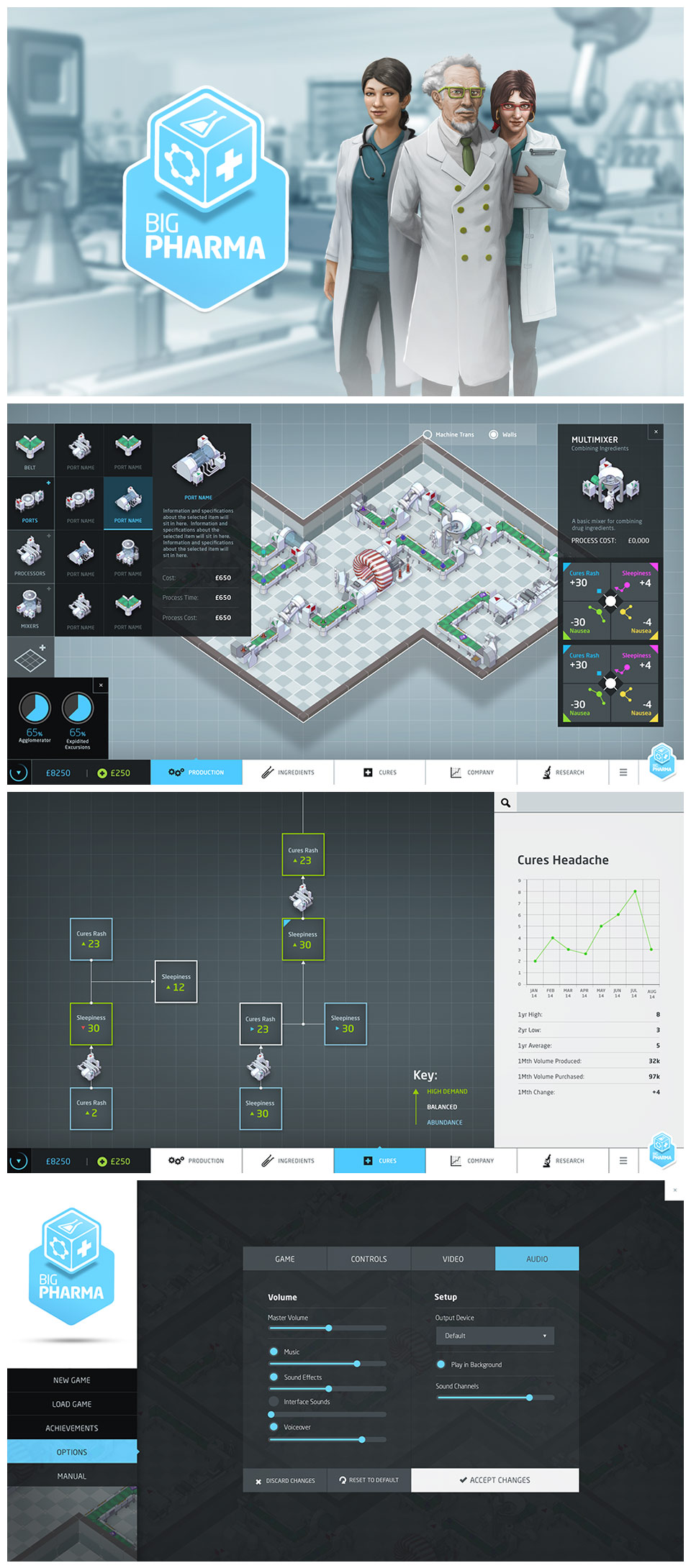
Working on the UI design for Big Pharma was part of a larger project that included both the website for the game and also the branding. The brief was clear from the outset, to take the clinical setting and create a design that made it both engaging and fun. We settled on some clinical blues and whites as the core palette for Big Pharma and then offset that against a couple of darker greys to create some strong contrast. Something that is vital in UI design in general. With the palette set and the brand created the UI came together very organically. I’m happy to announce that Big Pharma has a huge hit and Twice Circled have now begun their next title Megaquarium which I’ve been lucky enough to work on too! Congrats to the team and all their hard work!
Ethos
UI or user interface design as it’s properly known, has become incredibly important with the growth of interactive media. In one way or another people are interacting with devices in almost every part of their everyday lives and making that easier is always key. Games, apps, programs, website’s, they’re all of equal importance. For a UI solution to work its best it has to be underpinned with fully thought out UX design and only then can both work in harmony. I always aim to ensure that every UI design I create serves the user in the best possible way whilst at the same time looking great!


